CorrosionCOV app for iPhone and iPad
Developer: Ryan Jorgensen
First release : 08 Oct 2014
App size: 2.26 Mb
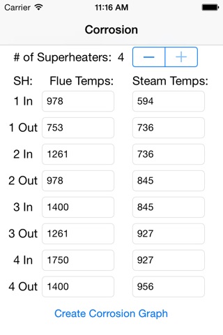
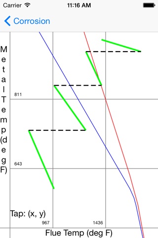
Given the flue and steam temperatures for each superheater bank (supports plants with 1 to 4 banks), this app graphs the information against corrosion lines. The area below and to the left of the blue line is the "safe zone". Between the red and the blue line is the "transition zone". Above and to the right of the red line represents the "corrosion zone", where direct damage to the pipes is being done.
Due to the wide temperature ranges supported and relatively small screen size, the graph is largely meant as a visual tool. However, tapping anywhere on the graph will provide the coordinates of the tap and display a small "+" sign. While still not perfect, this feature allows the user more precision than the naked eye.
A version for the iPad and one more suitable for the larger iPhone 6 and 6 Plus will be following shortly.
Thank you, I hope this helps someone.


